The Project
Adaptive biotechnologies translate the scale and precision of the adaptive immune system into
products to diagnose and treat disease. As a pioneer in the healthcare industry, the company elevated
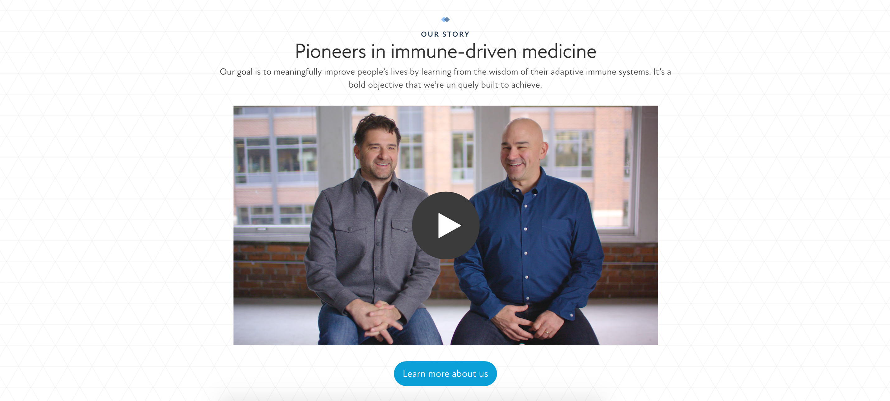
its business to the next level to be more accessible and modernized through the new visual system.
The goal was to build universal alignment for all stakeholders and audiences by using unique illustrations
and selected imagery.
My Role
I joined a design agency for the junior year of my career, so very excited about the project that
had the possibility to make a great impact on rebranding a brand position.
I worked with a creative team to develop concepting mood boards, colors, typefaces, and photography.
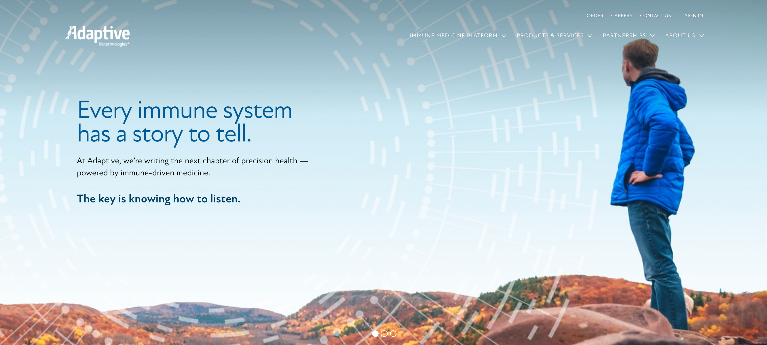
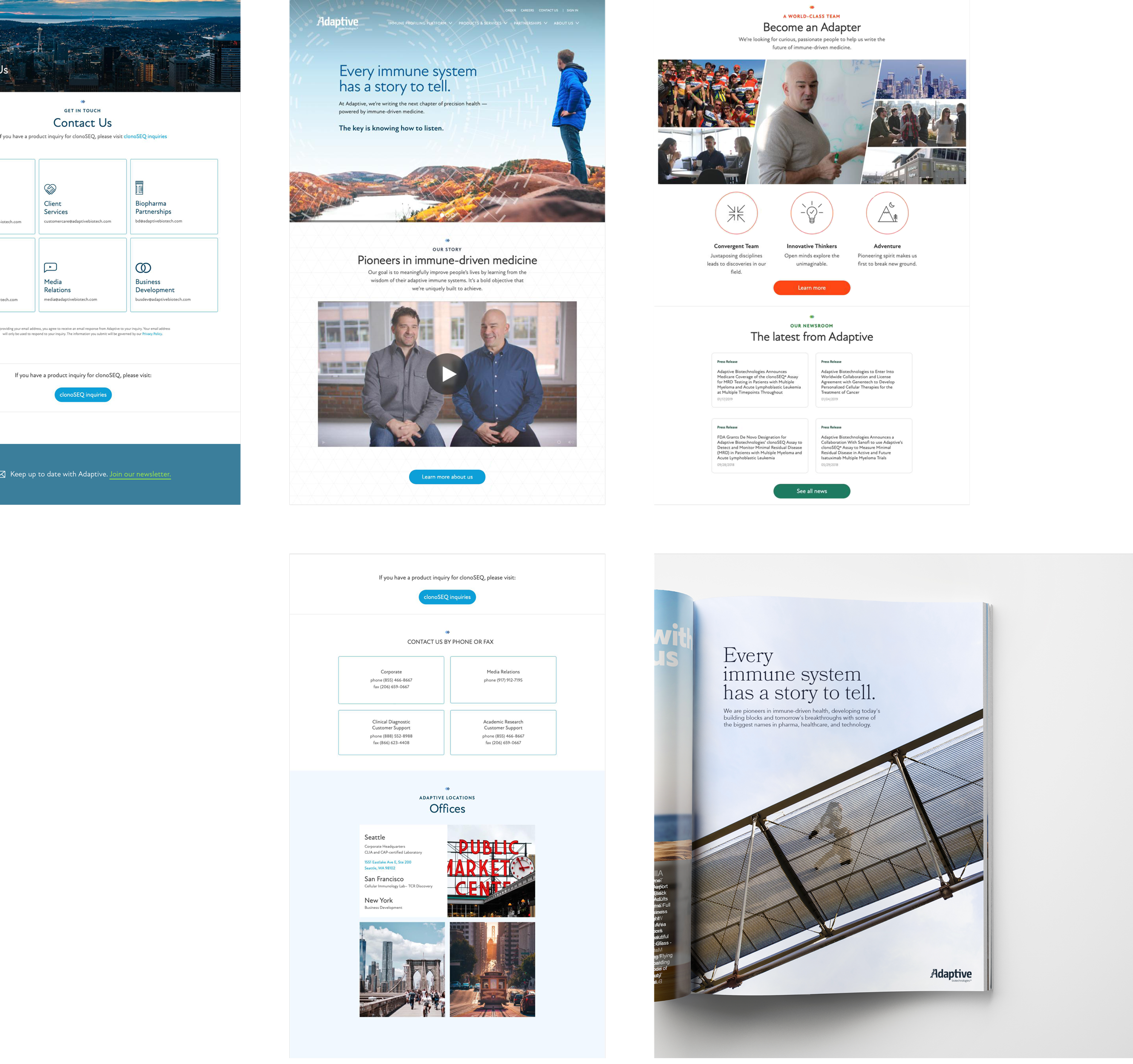
I was assigned to develop visual communication, including hero illustrations, icons, brand merchandise,
web and mobile sites, and motion videos for advertising. The design goal I set was that
all these visual elements could be easy to apply across multiple activations and mediums
but still memorable and cohesive.
My primary achievement was to build a strong, strategic brand asset that amplifies the message to a larger audience
and attracts users aligned with the client's needs. Current customers still perceive Adaptive in the rebrand,
while potential customers find the new identity more fresh and approachable.

 r
r


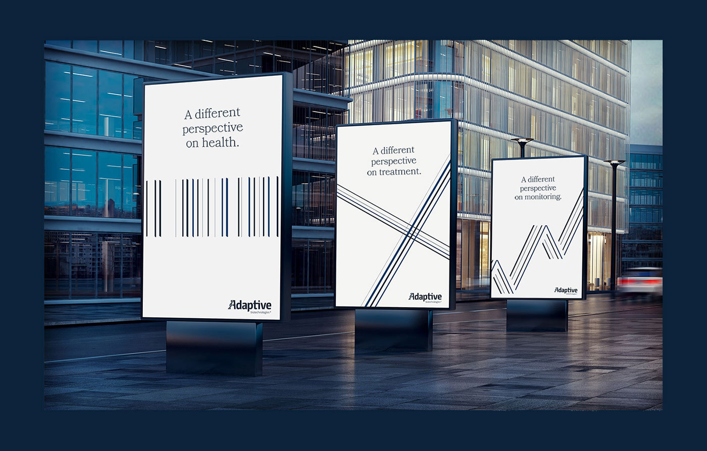

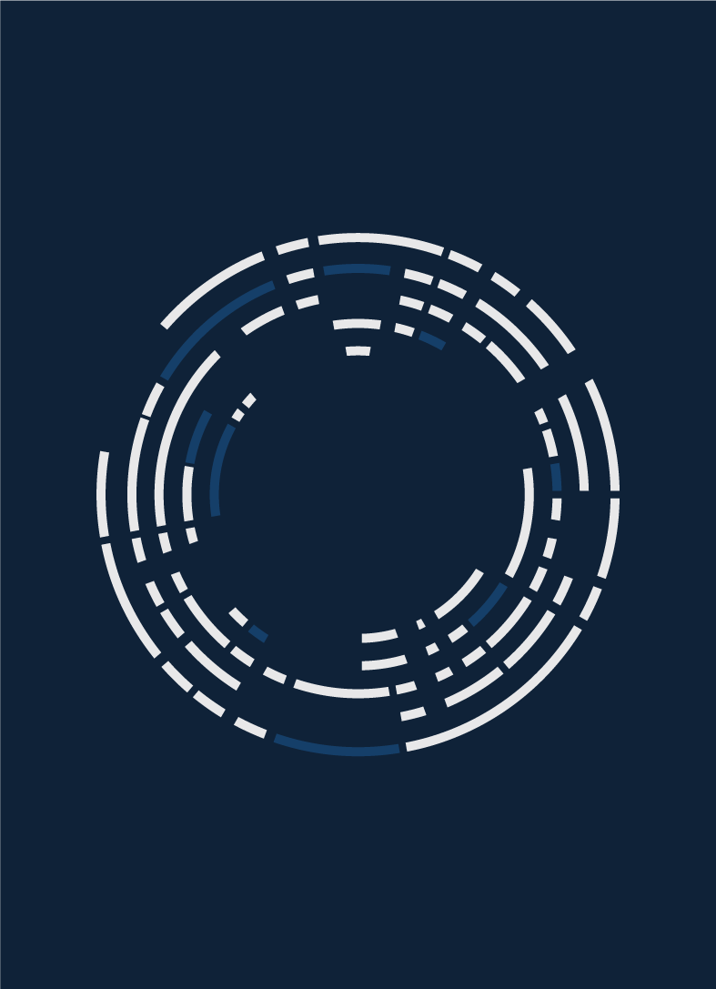


{Balance}
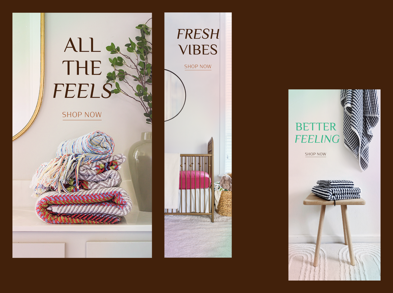
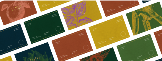
The illustration is not only used by themself but also applied creatively across a range of media over the photography. Our digital-first design approach ensured that the visual concepts integrate into other design elements.
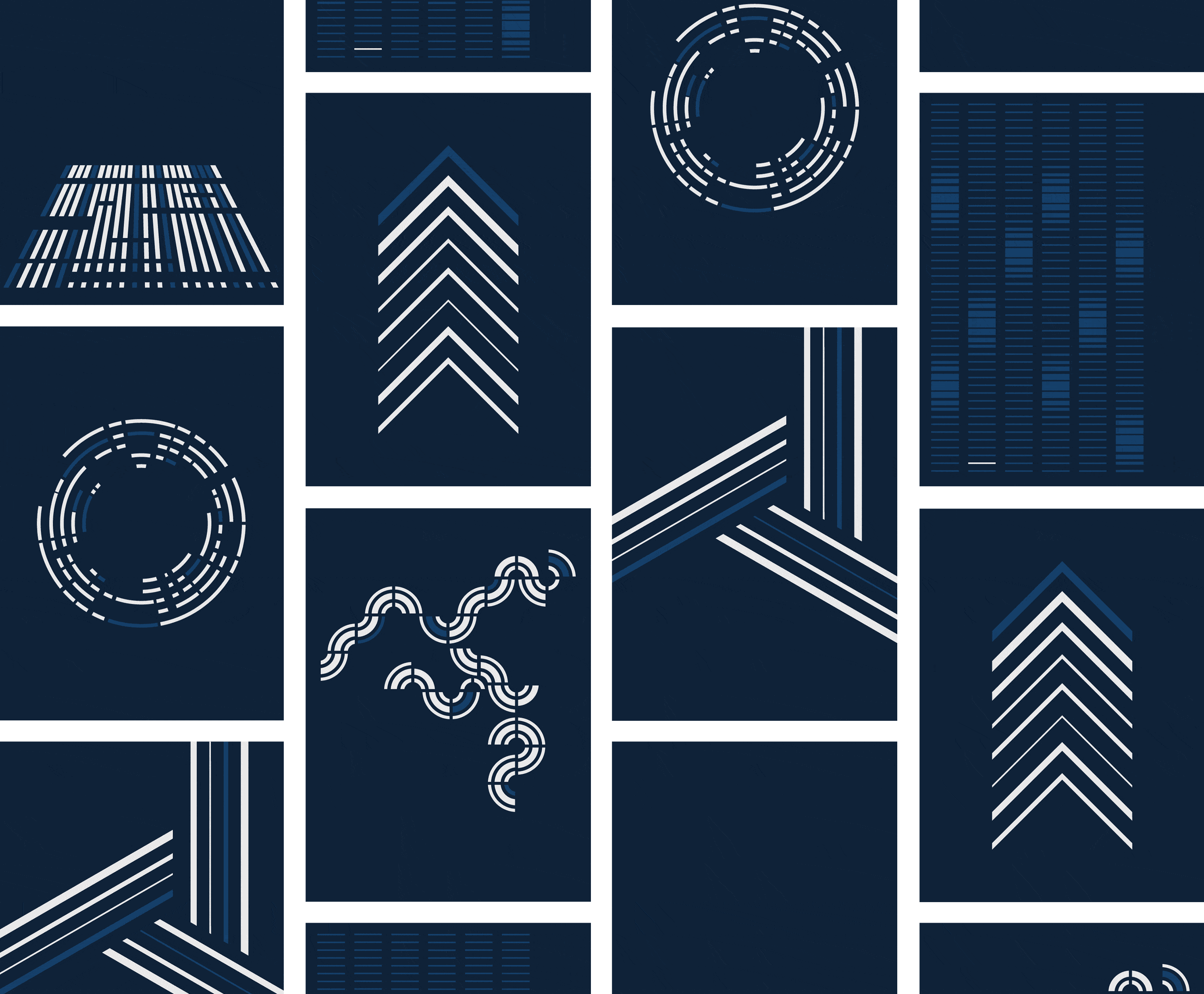
{Result}
This simple but effective approach allows the brand to output assets easily at a large scale for use across marketing touchpoints, print collateral, motion, and more. The creative direction was not to be too literal and abstract. Developing a way to adjust in between was quite a journey that own keen eyes on details.